
You’ve only got a short window of time to captivate a user. Psychology and web design play a crucial role in subtly persuading users to explore, convert, and become fans. A good website should be fluid in its navigation, with strategically placed elements that work together as a whole.
The purpose of this article is to teach you how to create a successful web design using the psychology of web design along with concrete elements such as colors, spacing, layout, typography, and shapes in order to sway users’ behavior.
It is important to use web design best practices if you want your website to stand out from the competition. Many people understand web design best practices, but do not fully grasp how those practices influence the user.
There’s more to designing a great website than just having a nice one. A quality web design company should provide insight into the psychology behind designing a great website – those factors that will subconsciously engage and attract visitors.
A great image and attractive design are important, but you should also understand how different elements influence the human mind when developing your design ideas.
The importance of user research when designing websites
There’s no point in listening to your opinion when it comes to the design and usability of your site.
You shouldn’t be dictating the design based on your biased perspective, but instead on data-driven insights and web psychology principles.
The only thing that matters is the website visitors. What appeals to them about your web page? Does the functionality confuse them? Is your design persuasive enough to keep them interested?
Direct feedback and data are essential for designing a truly customer-centric user experience.
The following two categories can be used to break down user research:
- Quantitative
- Qualitative
You can use quantitative user research to get metrics such as multiple-choice surveys, polls, and questionnaires.
In user research, mediums such as interviews and open-ended questionnaires are used to uncover people’s opinions and motivations.
It is quantitative research that tells you what, and qualitative research that tells you why. Both data points are vital to the design of your site (as well as its performance).
8 psychology principles that can prompt action on your site
What motivates us to act in particular ways? Why do we follow certain practices?
The most successful user research can’t fully reveal how subconscious decision-making happens — because, in most cases, people don’t know themselves the answers.
Websites must be created in a way that makes users feel comfortable and encourages them to take action. The following eight principles are based on human behavior and psychology to help you create great websites:
1. Hick’s Law
If you are struggling to decide what to eat from a huge menu, Hick’s Law says there are too many options available. The same goes for your website design.
It was coined by British and American psychologists William Edmund Hick and Ray Hyman and describes how long it takes for someone to make a choice based on the number of options available.
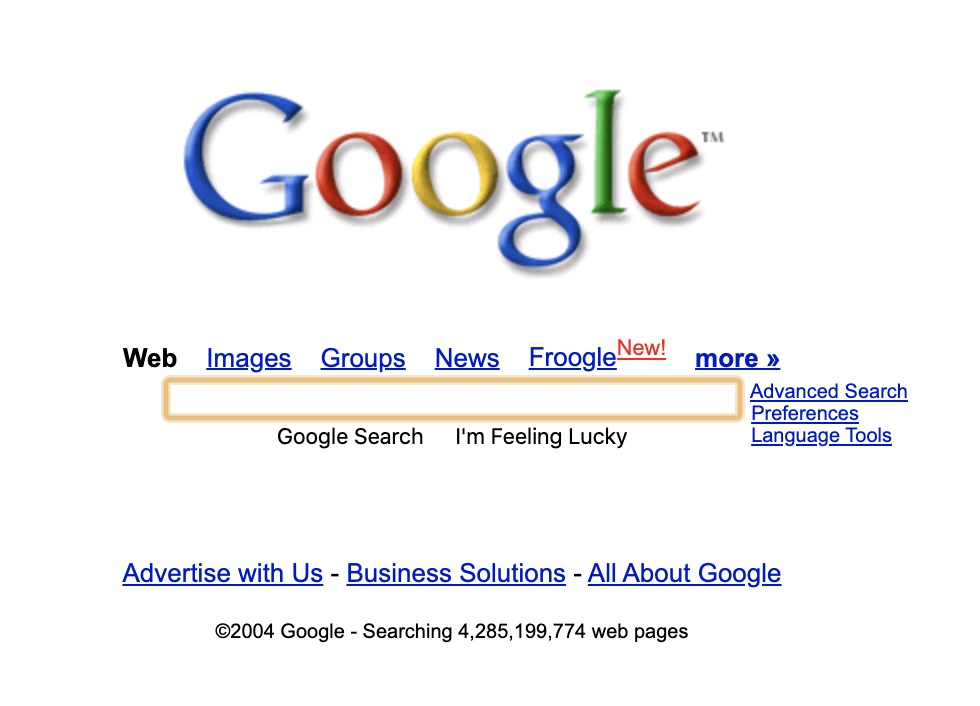
Take a look at Google’s homepage from 2004:
As compared to today’s version:
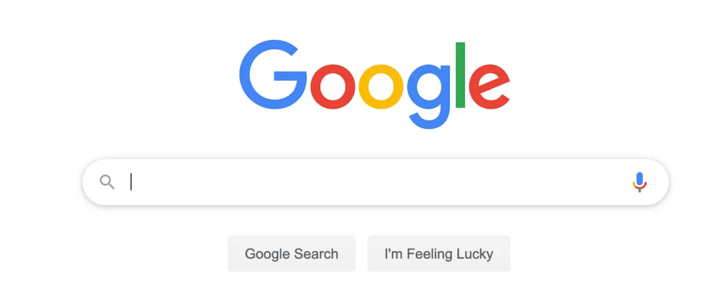
The majority of links have been removed or reassigned to the search results page in order to reduce the number of options.
This is true when looking at a large library of products. The antidote? Filters. By reducing the amount shown and reducing the time spent on decisions, you can reduce the amount of time spent on searching for products.
There is an advanced filter system on every product page of ASOS’s shopping website, which begins with the menu and extends throughout the site’s navigation menu:
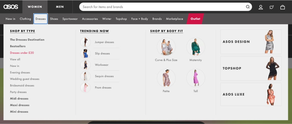
Using this feature, customers can quickly find the section they are looking for, and narrow down their search based on features such as price, occasion, and size.
If you hover over a product, you can also add it to the cart. Clarke’s Cakes & Cookies provides an “Add to cart” button when you hover over the product:
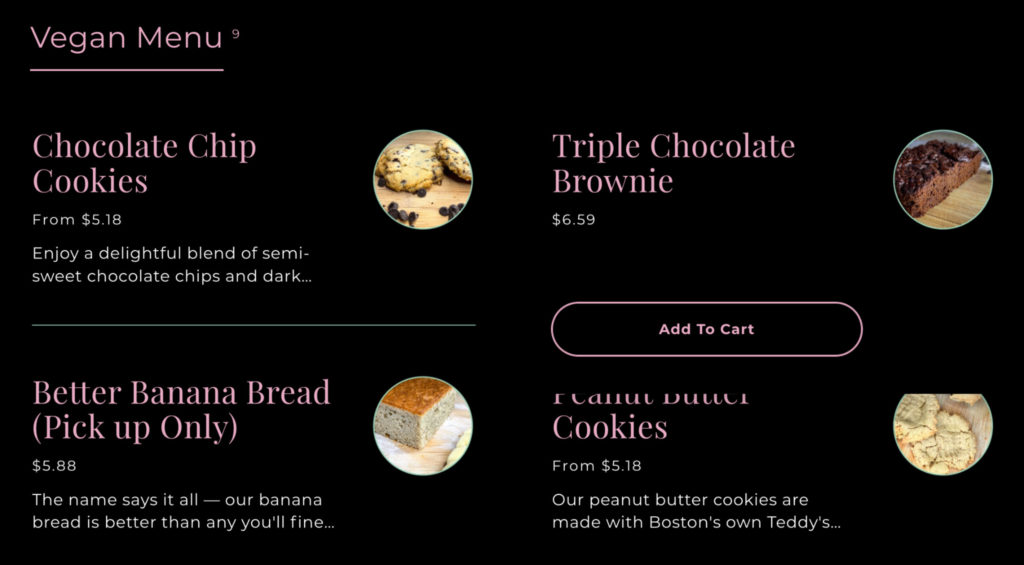
The user does not have to click into each product page in order to purchase the product.
The goal is to simplify decision-making, otherwise users may experience the “Paradox of Choice”, taking too long to decide, choosing nothing, and leaving unsatisfied.
2. Fitts’ Law
According to Fitts’ Law, both the size of a target object and its distance from its starting point affect user engagement. The larger and closer a target object is, the easier it is to interact with.
It is regarded as the cornerstone of human-computer interaction. However, it was created well before web design was ever invented.
According to psychologist Paul Fitts, human error isn’t always caused by mistakes made by an individual. It can also be caused by bad design.
Spotify makes the “Play” button stand out from the rest of the screen for this reason:
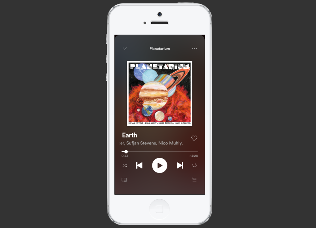
The placement of buttons is also carefully considered: on mobile devices, it is closest to where users normally rest their thumbs.
A Fitts’ Law button doesn’t have to take up the whole screen to be effective. Instead, it’s about pinpointing your most popular buttons and making them as easy to use as possible.
3. Gestalt design laws and principles
A human’s innate need for order in an otherwise chaotic world is deeply ingrained.
This theory is the basis of Gestalt psychology, which was coined by Max Wertheimer, Kurt Koffka, and Wolfgang Kohler and means “unified whole” in German.
The researchers discovered that the mind “informs” what the eye sees. To put it simply, we perceive separate objects before we look at their minor details.
It follows that Gestalt psychology has a number of rules and principles that can be applied to website design:
Proximity
A group of objects overlapping in proximity will be seen as a group by our social media scheduler Hootsuite. This screenshot shows the related images, colors, and icons:
It might be hard to tell that these two visuals are part of the same feature if they were farther apart.
Similarity
Similar items are naturally grouped according to common characteristics. An educational app, Moneywise, uses colors to separate sections in its navigation menus:
Those images are then carried over to the background of each card, so the user can better understand where he or she is and find their way around.
Closure
We fill in the gaps of shapes that don’t close completely or parts of images that are missing. An example of this is the panda logo in the WWF brand:
A simple design is more attractive than one with more complexity because the principle of Closure makes it more interesting to see the whole animal, even if its body and head are unfinished.
Common fate
When an object moves in the same direction, it appears to be belonging together. You can use this technique in web design to focus the user’s attention on a form, like the one on Buildium’s landing page.
The sticky form reinforces the principle by drawing attention to the parts that aren’t moving.
Symmetry
Our minds connect two symmetrical elements to form a coherent shape when they are separated. Gucci used this tactic as part of its SS18 campaign website.
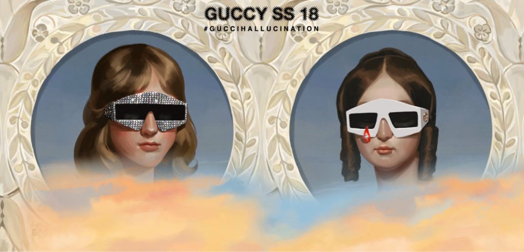
Users can feel more comfortable using a landing page if it is symmetrical. Symmetry can be found all around the natural world.
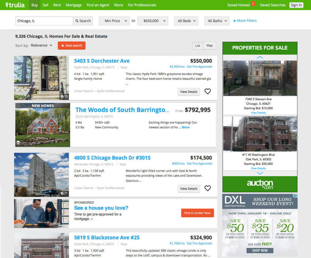
Continuity
The arrangement of elements on a line or curve looks as if they’re related. You see this on most mobile app product pages, where space is limited to encourage users to scroll. Trulia uses the same strategy on its desktop site:
A great example of using this principle in a logo is that of Amazon. The arrow leads the eye from A to Z, subtly suggesting the site’s enormous range of products:
Besides being an orange smile (we’ll discuss colors soon), it also conveys warmth and positivity.
Common region
We group objects within the same closed region. Like Chatbot, most landing pages feature this type of organization:
As an example of each of the above laws in action, here are the following:
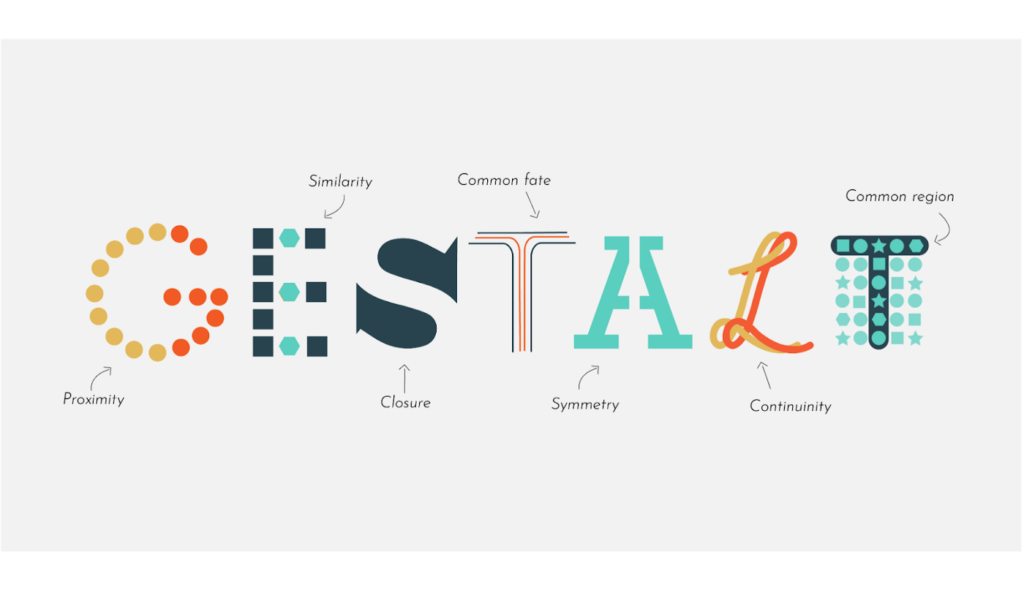
When you design a website, you’ll see Gestalt principles everywhere. Use them to organize your content and make it easier for users to navigate and understand.
4. Visual hierarchy
When you visit a website, what is the first thing you read?
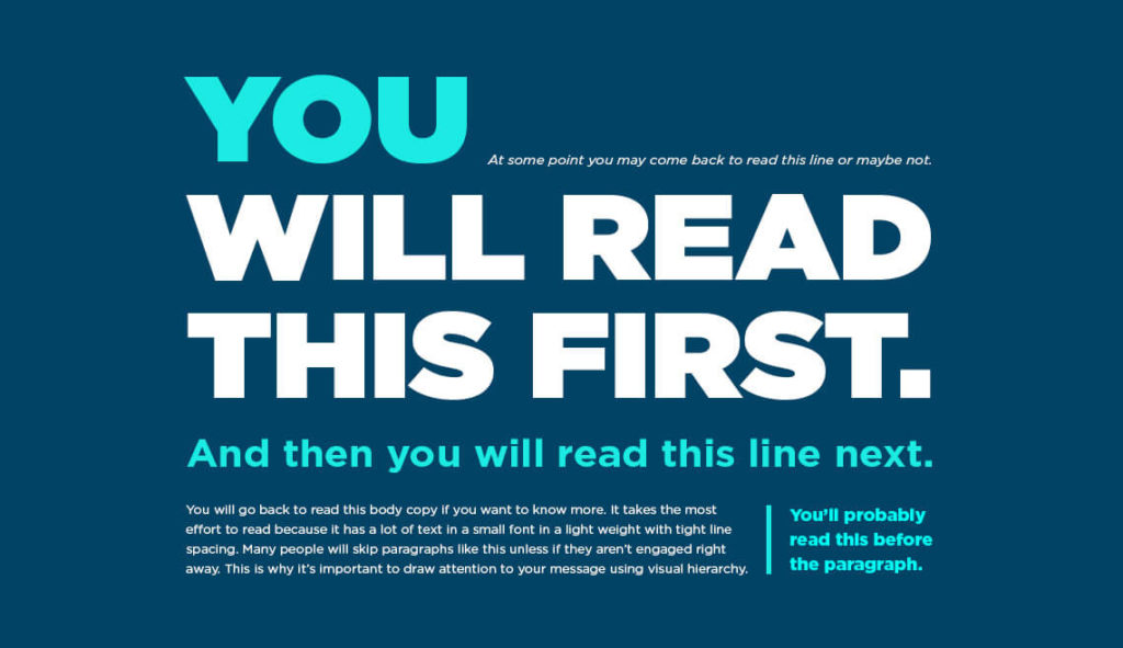
The Gestalt theory states that order must be brought to chaos through visual hierarchy, which is how we view and process visual information.
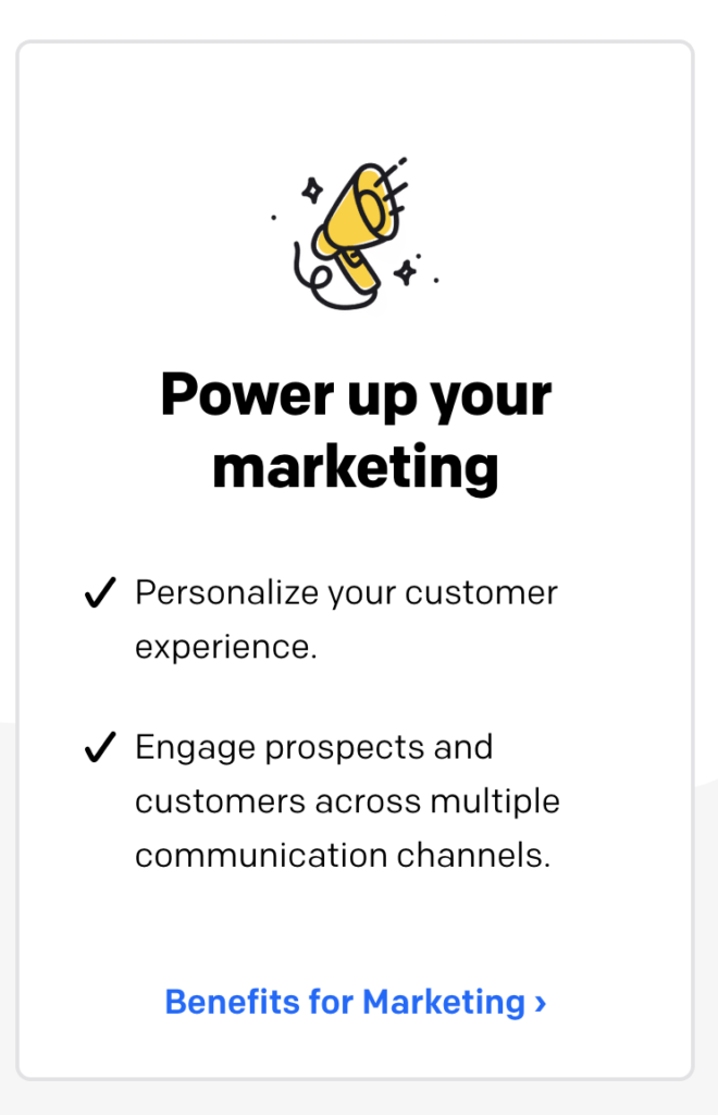
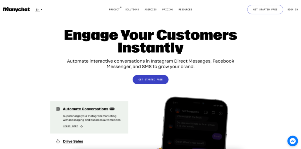
A chat marketers Manychat uses size to draw attention to specific elements on a website (such as call-to-action buttons and forms).
Colors and shapes are used in Ortto’s marketing automation solution:
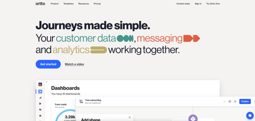
As a web designer, proportion is everything. You can also use animation or contrast to achieve the same effect.
In design, for example, the Golden Ratio is 1.618. The proportions within a design should conform to the formula in order to be aesthetically appealing.
To find the perfect length of the bigger element, begin by choosing the length of the smallest element. Next, multiply it by 1.618 to get the ideal length.
The following is what it looks like in mobile UI design:
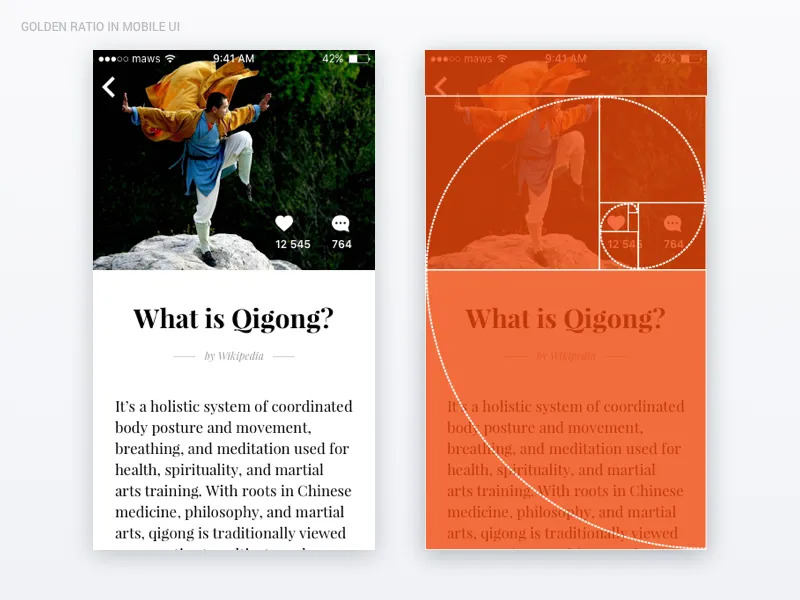
As with natural weather patterns and plants, web pages that follow this proportional logic appeal to the eye. This proportional system has been used for centuries in traditional art and architecture.
If you can take advantage of this subconscious familiarity to make your UX more appealing to new users, you can help them feel more comfortable-even if they don’t know why.
5. Occam’s Razor
According to William of Ockham’s problem-solving principle, the simplest solution is usually the best. And he is right. When two competing designs perform the same function, the simpler design almost always wins.
A user can use this choice when choosing design prototypes. But a user can also use it when narrowing down CTAs. Intercom’s homepage provides two choices:
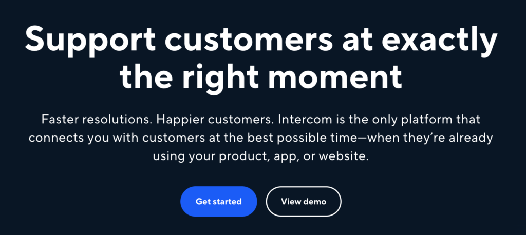
We have two routes for people looking for more information. We have another path for those wanting to get started right away. Simple solutions remove friction and keep people moving forward.
6. The Von Restorff Effect
A landing page contains certain elements that jump out at you. What is the purpose of these elements?
The behavior scientist Hedwig Von Restorff found that distinctive items are more likely to be remembered than ordinary items. In a site where there are so many visual elements, you need to make note of the items that matter most.
It is common to see this theory used on pricing pages. For instance, Basecamp’s Pro package has a red outline and orange overlay:
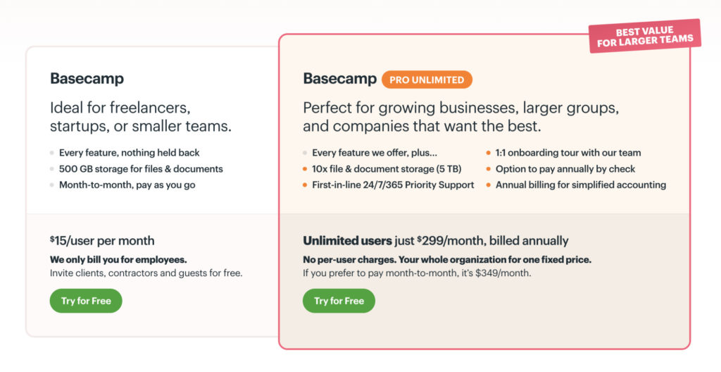
These techniques are used by brands to draw attention to their most profitable packages.
It is also the psychological principle behind CTA buttons, which are always larger, brightly colored, and isolated in order to improve conversion rates.
Your web design should be distinctive in any way that you want to stand out.
7. The Zeigarnik Effect
There’s a reason TV show cliffhangers stay in your head so much: the Zeigarnik Effect.
It’s named after Russian psychologist Bluma Zeigarnik (whose professor was a Gestalt psychologist). She believed that we could recall uncompleted tasks better than completed ones.
Interrupting a task before it’s completed can help us retain information for a longer period of time because psychological tension is created.
It is therefore beneficial to use progress bars or check marks to encourage users to complete setting up an account (e.g. with Handshake):
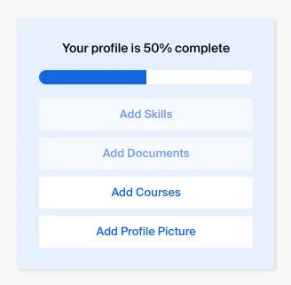
Having users feel unresolved tension is an effective way to make them feel satisfied once the task has been completed. It’s common in onboarding apps and education courses.
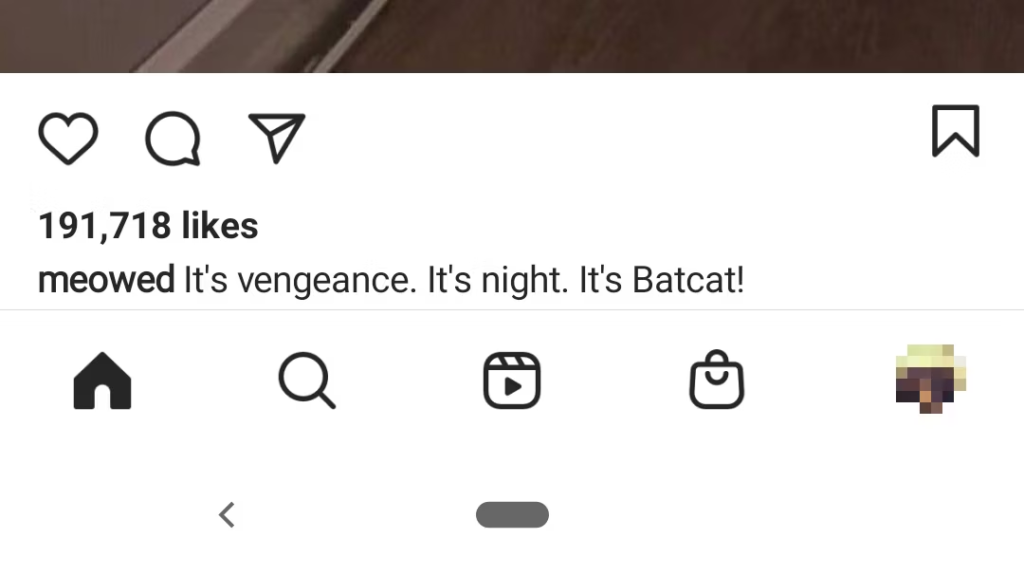
8. The Serial Position Effect and Peak End Rule
It is common for people to start reciting memorized items with the first and last items on the list.
This effect was identified by the renowned psychologist Hermann Ebbinghaus. It is attributed to the position of an item within a sequence. Items at the end and beginning are usually remembered more easily than the ones in the middle.
This is why Instagram puts the most-used profile and home buttons at the top and bottom:
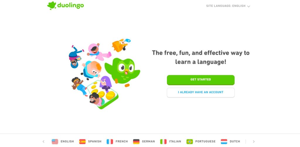
It is also suggested that we remember more of the emotionally intense parts of an experience and the end of an experience than any other part.
The Duolingo app regularly shares goal progress through colorful illustrations, positive associations, and fun illustrations in order to encourage users to stay engaged:
Understanding the sequence of your interface and the Serial Position Effect will help you minimize the loss of information during those middle stages.
If you use the Peak End Rule, you can create emotional highlights with your content. This will also incorporate any negative experiences you have. If you don’t mitigate these, you risk losing your users’ trust and, potentially, their business.
The Psychology of Web Design
People who are knowledgeable about design psychology should include it in their discussions. Those with expertise in this area always consider how certain elements of the web site will have an effect on their behavior.
A web designer’s psychology includes how changes in colors, spacing, and even typeface impact a viewer’s mood. These elements work together with emotional elements to influence how a viewer feels about your company and products.
There are several examples of psychology in web design, although it can cover a lot of ground:
Color
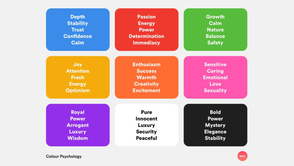
The way you use color on your website can affect your consumer’s emotional reaction. For example, blue conveys calmness and trust, green gives the impression of nature and wealth, while black represents luxury. The use of yellow and orange on call-to-action buttons is often successful, as these colors convey excitement and action.
Typefaces
A typeface may convey different meanings based on its appearance. Try looking at the New York Times masthead with its Old English font – that conveys authority and trust. Sans serif fonts look sleek and contemporary. Comic sans promotes lightheartedness and fun. Websites aimed at younger audiences usually use these fonts. Knowing your brand and target audience will help you determine which font to use.
Content
The benefits of personalization in digital marketing apply to websites as well. We have previously discussed the benefits of personalization in digital marketing. A brand that provides personalized content that speaks directly to its consumers – using the word “you” for instance – and discusses their specific interests provides a positive, friendly experience that creates trust.
Space
If a website is cluttered and disorganized, the site will be a turn-off for most visitors. On the other hand, one with little content or uncomplementary design elements will look flimsy and unsubstantial. When designing your site, find the right blend of pleasing design and content saturation, and balance them both to generate positive feelings.
Guiding Viewers
Smart web design companies create elements on pages to direct readers’ eyes, eventually leading them to the design element you want them to focus on, usually a link to another page or a call-to-action. The guiding element you should use as you navigate your website is telling people what they need to do next. Just like it sounds, it’s telling them what they need to do next as they navigate your website.
Understanding Patterns
The most important elements of a site ought to be found at the upper left, middle, and bottom right of the page, because readers scan pages in a “Z” pattern. As humans, we are wired to read this way, so the websites we build should accommodate that.
Good web design companies will include these psychological approaches into their scope of work if you are in the market for updating your website.
Conclusion
Designing a website is not an exact science, but there are a few theories that can guide you.
A website that is effective will not solely use one psychology principle. Instead, it will use a combination of several principles coherently.
The strategy is the same regardless of whether you’ve got an entire web development team or just you. If you think you’ve developed something that works, then test it. Optimize it. Then test again.
The more frequently you do this, the more you will stay on top of your users’ subconscious needs.
The advanced experimentation analysis course from CXL will help you go beyond traditional A/B testing with advanced statistical techniques.
Frequently Asked Questions
Is UX design related to psychology?
Psychology plays a crucial role in UX design because it provides a deep understanding of how humans behave. Psychologists provide valuable insights into the intricate workings of the human mind, which can be used to develop intuitive and user-friendly products.
What degree is best for web design?
It is recommended that you major in areas such as graphic design, web development, or computer science if you are interested in becoming a web designer. These majors provide skills such as design principles, coding languages, and user experience (UX) design.
How is psychology related to design?
The study of psychology helps us define our underlying “blueprint” for how we perceive and process the world around us. As designers, we can leverage psychology to make products and experiences that are more intuitive and human-centered.